Hey, everyone! My name is Justin Treadway, a.k.a., GriffenValentine, and I wanted to share my drawing process with you. If you’re reading this, I assume you have seen the Twilight-themed art for the Player of the Year contest. I am the man responsible for that. Hopefully, you
thought it was funny — and if not, hopefully you liked the art!
I’ve been doing a lot of illustration and cartooning my whole life; in fact, these days it’s pretty much my job. But lately, my work is pretty boring
and I wanted to start drawing for fun again. There’s a world of difference between drawing for fun and drawing for a paycheck, and often the results of
that show in the work.
I’ve played Magic since the beginning, and an artist for my whole life… But, for some reason, I’ve never been interested in making fan art. Perhaps
because I like stylized simple cartoons, and Magic art couldn’t be further from that? Either way, that all changed when M11 came out.
For whatever reason, the idea of the Lorwyn planeswalkers getting “companions” really resonated with me. And I decided that I wanted to draw them
together. I decided to start with Garruk Wildspeaker (who is The Best, obviously) and his companion. I liked the result so much that I decided to doall the Planeswalkers, pairing them with an appropriate companion when needed. You can check out the first eight here.
I’ve done many Magic themed pieces since, and have gotten positive reactions from around the net. It’s been really fun. The point of this is that it
got me really interested in using my style to represent characters in a game that I love. I’ve had several requests to show my process for these
pieces, but haven’t really gotten around to it. When Evan contacted me to do the Player of the Year pieces, it seemed like the perfect time to document
my work.
Hopefully you’ll find my process interesting, since it is certainly a little weird, but it works for me.
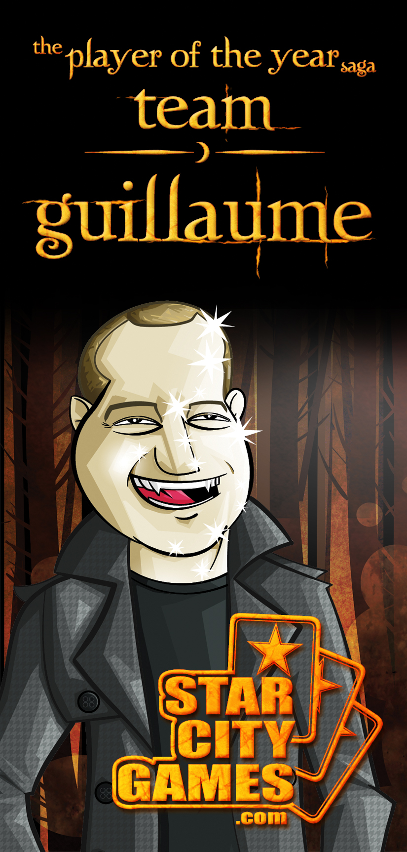
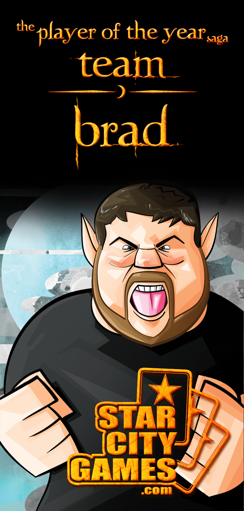
So to start with, I was told that StarCityGames.com wanted to spoof the Twilight “Team Edward/Team Jacob” thing. They wanted Brad to be the werewolf,
and Guillaume to be the vampire. The only other direction I was given was to emulate Brad’s iconic Grand Prix: DC victory shot, which I was informed
was “werewolfesque.” So that’s what I had to start with.
My process begins with Adobe Illustrator. I was trained in traditional inking and painting, so I feel most comfortable holding a brush in my hands, and
inking with that. However, these days digital is just such a time saver for an artist that 2D methods have become a little obsolete. I like to
ink in Illustrator because for me, the smoothness of a vector line simulates pushing ink across paper in a way Photoshop can’t.
So I go into Illustrator and create a calligraphy brush with a stroke that goes from razor-thin to really wide and blotchy. To me, this simulates a
brush. The other nice thing about Illustrator is that if you get a line you are 98% happy with but want to tweak it for that 2%, you can just go in,
grab an anchor point, and fix it to your liking.
To start with, I found some photos of the players and put them up on one of my screens. Then I got to work just sketching. I started with some really
fast messy lines, just trying to find the right contour. Once I felt like I was starting to get a base shape I liked, I started a new layer. On this
layer, I tried to refine the lines a little more, so that it looked like a rough sketch.
Sometimes this is a fast process; sometimes it takes a little longer. Luckily, this time wasn’t too bad. I’ve drawn Brad before, and Guillaume has a
lot of interesting and unique shapes on his face that makes it pretty easy to draw iconic landmarks. The end result of step one looked like this:
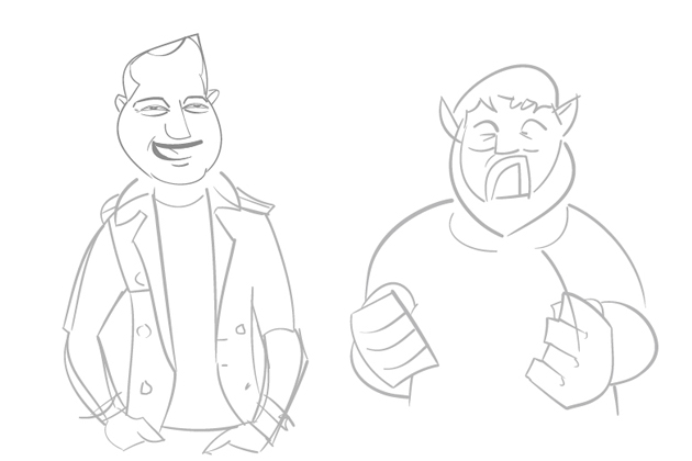
Not a refined sketch, but a basic road map that allowed me to move on.
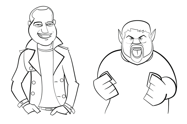
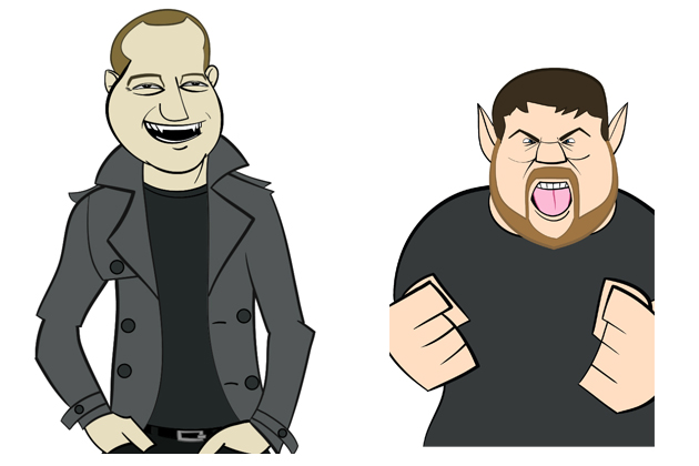
My next goal was to tighten up this sketch into finished line work. Luckily for me, I was drawing in digital ink, which turned a two-step process into
only one step.
What I was looking to do with these lines was to give them some life. I knew how I wanted to color them, but color can only say so much. It’s important
that the lines have a flow and life of their own. I really wanted Brad’s fists to pop off the page, so I made them big chunky mitts (like The Thing). I
also wanted Brad to have a lot of bold lines, lots of thin to thick.
For Guillaume, I really wanted him to have a light relaxed feel, so it was important that all his lines flowed down smoothly. Here’s the
result of my finished lines:
Before I moved onto color, there was one more step: I like really bold, cartoony art. So sometimes, when I color those lines, I don’t want the contour
to be black. Sometimes, I want the contour line to match the inside color. Usually I do this for hair, cloth, metal, energy effects, and sometimes
skin. It’s just an intuitive thing for me; I look at some lines and just don’t want them to be black. There’s no real hard science to it. It’s hard to
explain, but I feel like this really helps. Here’s an example of this:
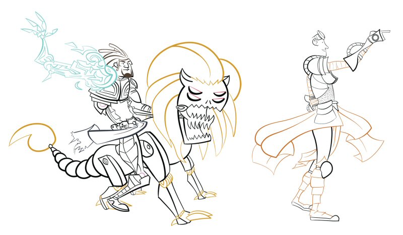
As you can see, I wanted the cloth on Tezz and Chandra to stand out from their armor, so I made it match the interior. Also, it was important that
Tezz’s etherium arm really pop, so I wanted to set it apart.
Anyway, you can see what I’m talking about. For Brad and Guillaume, there wasn’t anything too crazy to do, but I still think even a little helps.
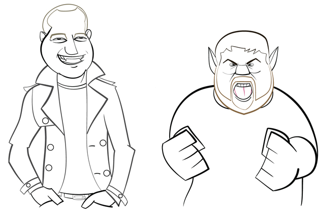
In this case, I really just wanted their hair to stand apart, and I wanted Guillaume’s jacket to be not solid black, but to be a lighter gray.
Does this stuff help, or am I just crazy? Who knows? Thankfully, this is another thing that Illustrator really helps me with. I just click on the line
I want, and instant color change!
Okay. So the inking was finished, and it was time to color. This time, it was a job for Photoshop.
Occasionally, I’ll color in Illustrator if I need full vector art, or if I want to paint. But to start in Photoshop, I need to bring in my vector
lines. If you’re using Photoshop CS4 and up, you can finally bring in your vector art as a “SmartObject,” which allows you to keep the smoothness of
your lines. Otherwise, you’d have to rasterize your perfectly smooth Illustrator lines, and that is criminal.
After the lines were in, I duplicated that line layer twice. This gave me a total of three layers of line work. Again, this was a tweaky thing I did,
and here’s why: I took the bottom layer and rasterized it. This is the layer I used to lay down my flat colors. The second layer sat above the rastered
lines and all the color in the file.
The third and topmost layer is sort of a catch-all: sometimes, I get to the end of a piece and just want the piece to pop a little more. So, what I’ll
do is Multiply the top vector lines onto the vector lines below. Sometimes this matters, sometimes it doesn’t. Like I said, it’s a tweaky personal
preference.
The important thing at this stage is using the rastered layer to magic wand-select large chunks of space to color. I’ll select the areas I want to
color on the rastered layer, but I’ll add the flat color on a new layer above the rastered lines. This allows you to fix mistakes
easily. If you’re laying flat color on your lines directly, it’s impossible to delete large chunks of color; you’ll always leave some random pixels
behind.
So basically, I just magic wand-selected my area, then used Select>Modify>Expand 1 on my selection on the flat color layer. The reason you expand
the selection is to ensure you don’t have any random white pixels that the wand couldn’t grab; remember, you have a layer of vector lines above your
colors that will mask the expanded selection.
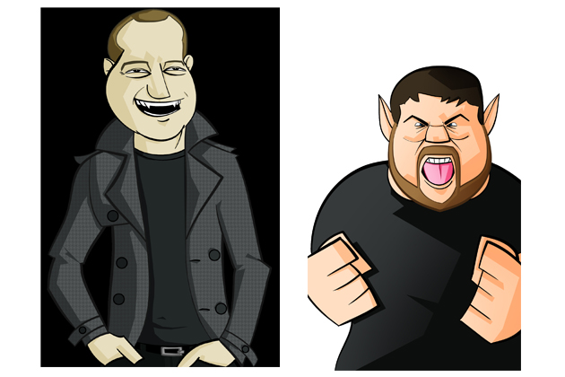
The result of this stage:
This was just the basic color flats. This function as your guide as you color. Sometimes this part is time-consuming, but ultimately it’s the most
important part. You need a solid base if you want to build on it.
The next step was picking my light source. It’s important to know where your light is coming from before you start adding your shadows. I knew that
these pieces would be standalones, but that they would also be linked together… So I wanted the light source to be in the middle of the two, shining
down and out. I can’t stress how important it is to figure out your light source. This often makes or breaks your piece.
I like to add my darks to the piece, so that’s what I did next. I find that once I get the darks in, the piece really starts to take shape and gain
weight. I added my darks on a layer above the flat color.
I like to give each section its own layer. For instance, the shadows on Brad’s shirt exist on a layer separate from his skin. This allows me to have a
much greater control over how the darks behave.
Also, another tweaky little thing I did before I added my shadows: I laid down a gradient layer of shadows. If you look at Brad’s shirt, you can see
the flat color, the solid shadow — and then, in the mid-tones, you can see a gradient going from dark (bottom right) to light (top left). I feel like
having a gradient shadow that sits below all the other shadows ties the piece together. Again, this could be my craziness, but I think it matters.
You can see that I was simply laying in large chunks of shadow. I was using the shadow to help form shapes that didn’t exist in the original line work,
which is very apparent in Brad’s torso.
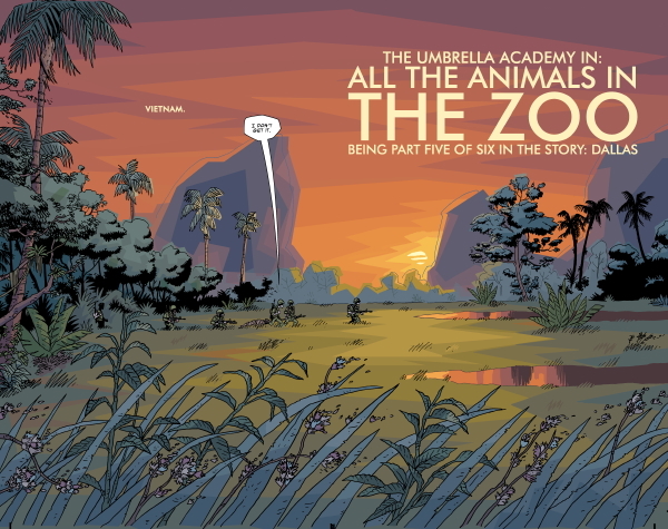
I like to color by adding large chunks of color. Some people refer to this as “cuts”. One of the best colorists in the industry is Dave Stewart (of the
comic series Umbrella Academy), who lays down large chunks of color that sell as massive shapes. I’m
very partial to this style, and as I add more value to this piece, note that I am just laying large chunks of color next to (or on top of) each other.
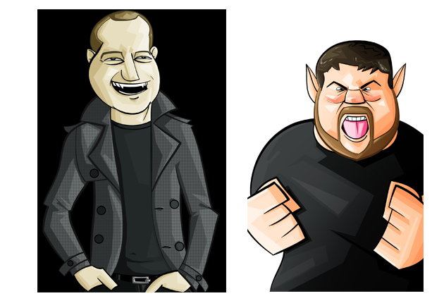
For the next step, I wanted to start adding my highlights. Once again, follow your light source! This part is actually pretty easy, since you have your
flats and your darks to guide you.
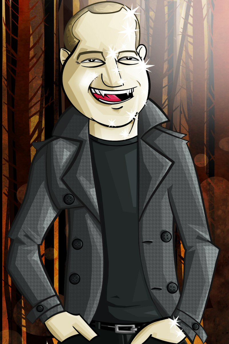
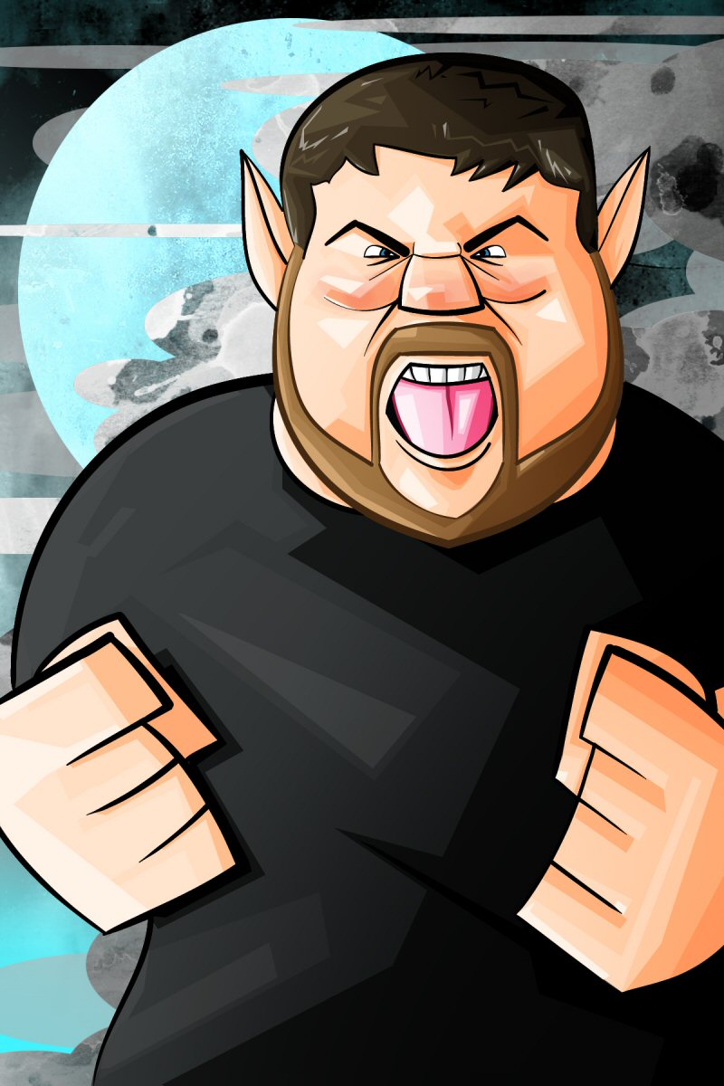
The nice thing about building up the piece like this is that each step took less and less time. At this stage in the piece, I really wanted to bring
out the folds in Guillaume’s jacket, and I really wanted his face to be covered in light. The reason I needed his face fairly light was to sell the
silly “shiny vampire” effect from the Twilight movies. Also, note that in addition to adding highlight’s to Brad’s face, I gave his face some reds.
Brad has a fairly rosy face, and I think it was important to capture that in order to sell it as Brad.
At this point, I was feeling pretty good about the piece so far. Usually at this stage, I’d take a break and just stare at the piece while I worked on
something else. I find that if you look at your work out of your peripheral vision while you do something else, your eye starts to find problems.
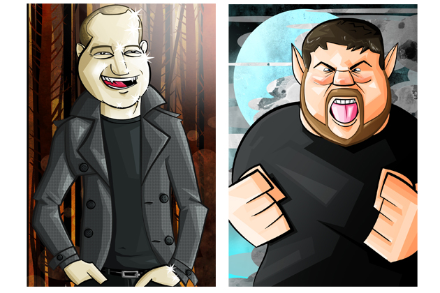
And then it was time to add the backgrounds! I wanted to mimic the Twilight “Team” posters pretty closely — which meant that vampires went in the
forest, and werewolves posed in front of cloudy moons. The nice thing about this was that these compositions really started to set the pieces apart.
Guillaume was tall and thin, with warm colors and vertical backgrounds. Brad was short and wide with cool colors, and horizontal backgrounds.
To start the backgrounds, I flattened my image and brought it back into Illustrator. I wanted to lay down big representative vector shapes behind the
character. Basically, I wanted to sketch up the background, much like I did for the characters.
This piece wasn’t too complicated, since I wanted the characters to be front and center, with the background to be pretty simple. Eventually I was
happy with this base, and brought it back into Photoshop. It looked like this:
The next step for the background was to give it some value. I did the same process for the background that I did for the characters. Once I had some
light and shadow, I wanted to give the background some style.
What I like to do for my backgrounds is give them a stylized watercolor/textured look. I like for my characters to be crisp and simple, and their
backgrounds to be stylized and arty. You can see that very clearly with my Planeswalkers. I’m partial to the classic Disney look,like in Pinocchio here: now that’s a character that pops off the background!
I accomplished this look with a series of custom watercolor brushes, and textures that I built on top of each other. I used to be a texture artist, and
those skills really helped me add some life to my backgrounds. I think it gives my piece a unique look.
At this point, for all intents and purposes, the piece was “finished”… But we all know that it’s never that easy.
Again, at this point I like to put the pieces up on my side monitor and just kind of stare at it for a while. I’ll start to see things that I want to
change, or fix. Ultimately since I don’t have infinite time, I’ll make the decision to call it final.
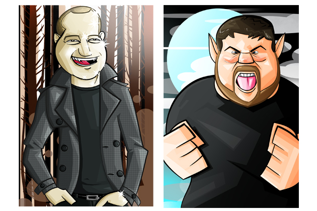
After my last batch of tweaks, I was left with these two finished pieces:
The hard work was done!
The last thing I needed to do was mock up the text for the pieces that will appear on Facebook and StarCityGames.com. To really sell this piece as a
Twilight mock, it’s important to mimic the font, and copy the layout from the posters. I obtained the font, and then got to work copying the weird
layout from the posters.
Why does the text have those stupid busy lines on it? Who knows? But they need to be there.
Eventually, I was satisfied with the font treatment. The last thing I did was to take the StarCityGames.com logo and “Twilightify” it. Eventually, the
final piece looked like this:
Hopefully you enjoyed seeing the process! Feel free to ask me any questions you have in the forums! Thanks for reading!
Check out my art blog, for some Magic related art and shirts:
Other Side of the Planet
And come follow me on twitter:
@GriffnValentine