In this series, I’m going to go through my cube, section by section, and compare the available printings of each card. I’ll give my opinion on which is
the coolest/prettiest/most charmingly old-school — but since this is a side-by-side comparison of art and version, it should be a useful reference even
if you don’t agree. If I missed something, let me know!
Note: I work on the general rule that I like cards to be foil, but I’d rather have nice art than foil if that’s the choice.
White
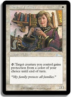
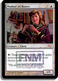
I like the Duel Decks version here. Her hand placement is a little awkward, but it’s so much less ’80s.
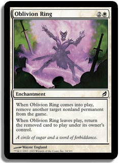
Frame preference aside, the Planechase version is a hell of a lot brighter and clearer. That’s my choice.
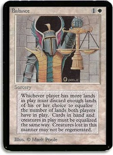
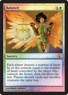
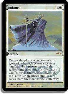
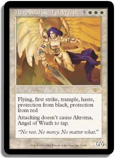
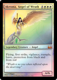
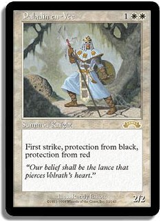
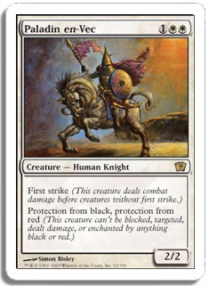
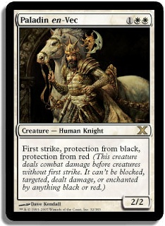
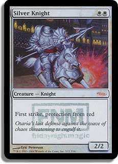
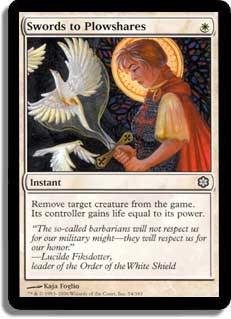
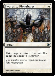
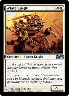
Man, these are all so nice! I’m a big fan of Kev Walker, and I think his Judge Promo is my overall pick. I love the super-glossy From the Vault foil,
though, and the art is really pretty. Couldn’t fault anyone for preferring the Alpha version as well — it’s like a suit of armor using a classy kitchen
scale! I enjoy the fact that the text is different on all three. Nothing is more charming than old templating.
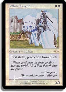
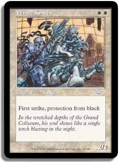
Same artist, same text — here I like the composition of the Gateway promo with the more prominent teeth.

I think the M11 version — with no text at all — is pretty sweet and classic. I don’t love or hate either piece of art, but I think the normal version
reads a little better.
The composition is pretty similar on these two, but it bugs me how dark the Judge Foil is. I prefer the original.
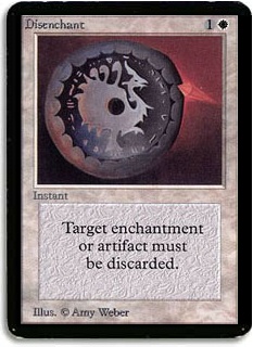
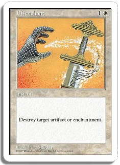
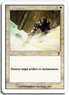
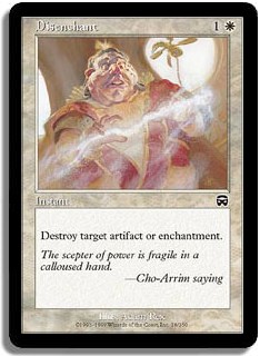
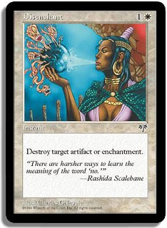
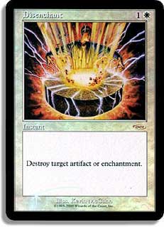
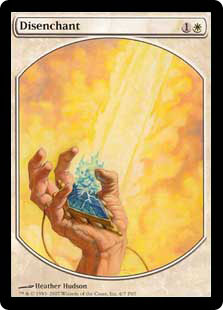
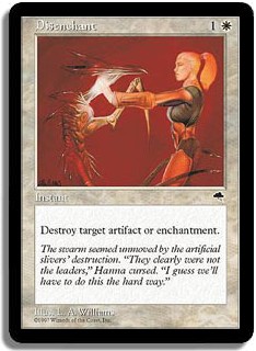
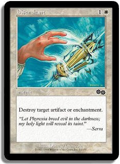
Holy crap — Disenchant! Can’t make up your mind? Some are so deeply random. What is going on in 7th Edition? A dude fighting a snow bank? If you like
textless stuff — I avoid it because I want my cube to be friendly to new players, having recently been one — that art seems fine. Otherwise, I like the
Alpha/Beta/Unlimited version with the insane wording.
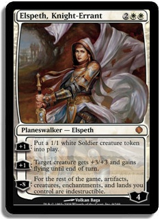
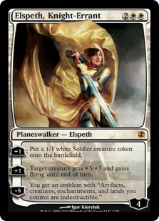
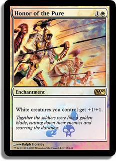
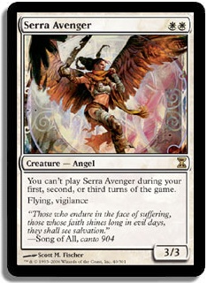
I never thought that a new Elspeth, Knight-Errant art could approach the old one in quality, but I like the sense of action and badassery in the Duel
Decks version. Heresy, maybe, but I’m going with the new one.
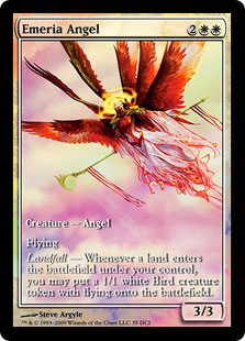
True story: I started playing Constructed to get this promo. It’s obviously the sickest and gets a shoutout in the Admonition Angel art if you’re into
intra-cube tie-ins.
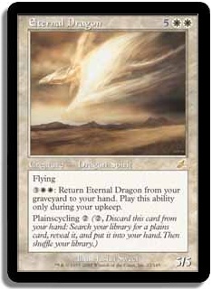
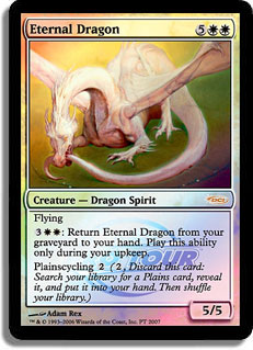
This is a hard one. I love Adam Rex and Justin Sweet, and the original art is pretty evocative. The Pro Tour foil is a little dopey — I call it the
Baby Milk Cow for reasons shrouded in mystery — but I love it deeply. When I find one of these, it will be in my cube. Or I guess when I decide to pay
the $30. You know what I mean.
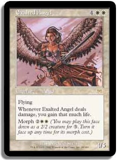
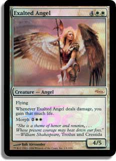
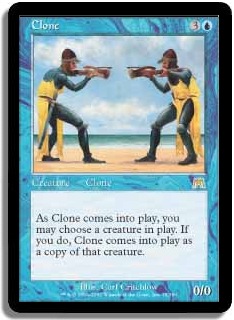
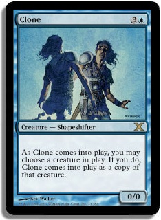
I admit it; I love the Morph without reminder text, but the bustier-and-thigh-highs is a little too “Exalted Angel as sexy Exalted Angel on Halloween”
for my taste. I’ll hold out for sweet, sweet reprints, or FTV: Angels.
Duel Decks, all the way. I don’t like the business or the palette of the original.
Both are nice, but I think I prefer the regular version. The watermark on the promo bothers me a little.
Besides possible nostalgia, literally any art would have been an improvement. Mine is in the mail. I’m super excited.
This of course is the same art, but I prefer the new border, so the FNM promo is my pick.
I like the FNM foil here. Actually I can’t say no to a pastel dragon-thing made of goo, in general.
The Exodus version is kind of adorably lame — he’s just posing for the camera, I guess? — but there’s something l don’t like about the 9th version. It
reminds me of a diorama, I think. My pick is 10th for objective prettiness but Exodus for nostalgia. When I find a foil from 10th, I’ll probably use
that. There’s a preteen girl inside me that likes the fancy horse, you know.
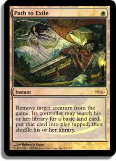
I don’t love everything Rebecca Guay does, but this is cool — kind of Klimt-y. Promo!
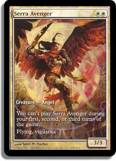
Yes and yes. I love me some SerraVeng, and I’m assuming that this is finally what I’m getting for my birthday this year, right?
Again, the same art, different frame. But Scourge has old foiling, so if you want new foil, it’s gotta be the FNM version.
The original art is so much nicer and actually reads as something more than kind of orangey. Definitely original/FNM for me. He’s also standing in
front of the Erratic Portal — again with the cube tie-ins!
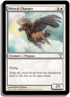
Mistral Charger loses here on flavor text alone.
I think the Prerelease version is slightly more terrifying/badass, though I like the sense of scale on the regular version. I’m going Prerelease.
I like the Ice Age version—I think it actually represents what the card does — but if I had the $50 FNM one, well, I’d probably run that. The Elspeth
vs. Tezzeret is really, really lovely, but it doesn’t strike me as particularly fitting art for this card.
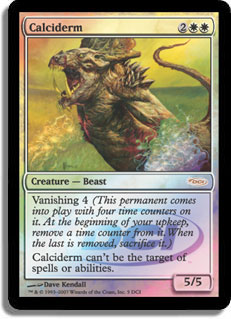
Oh, Legions version: I’m pretty sure it’s detrimental to your level of play to have to parse this kind of art. Avoid. I love the original art, and it’s
a sweet FNM foil if you can find it.
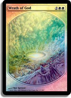
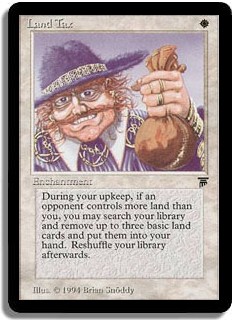
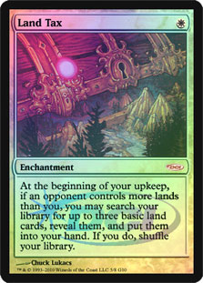
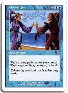
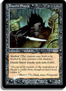
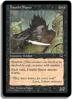
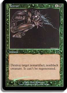
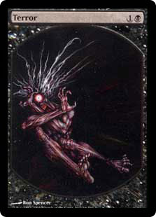
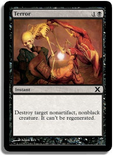
The Portal one seems okay — if you are into that sort of thing — and has the old hilarious reminder text bonus. The Alpha one is textbook visual
assault; Ron Spencer makes everything look vomit-y, and Kev Walker is not to be trifled with. And all his stuff is beautiful in foil. Case closed!
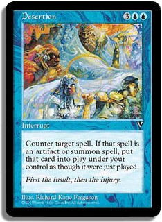
BLUE
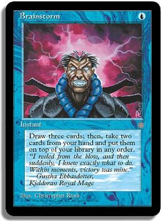
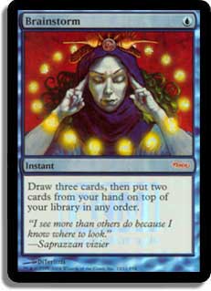
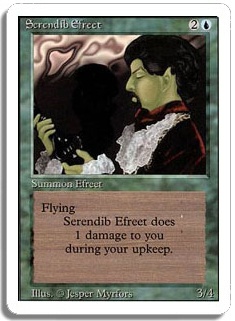
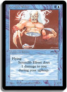
So we begin the trend of hilarously literal art in blue. Dude is starting a storm — with his brain. Yep. FNM all the way.
Eh. Kev Walker’s is the prettiest, but I like the Onslaught version as well. We run the Onslaught one. Justin’s choice.
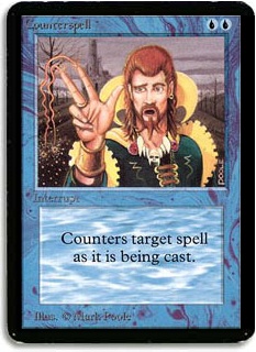
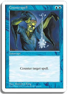
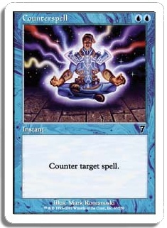
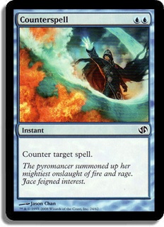
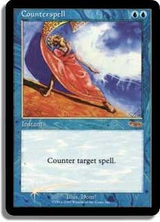
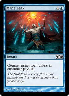
Does blue seriously have to make up for having good cards by having terrible art? The Jace one at least doesn’t make me think that it belongs to a card
that is, you know, only sideboard material if it cantrips. Maybe when Counterspell is reprinted the art will be awesome, and it will involve an
Elemental fish-with-wings cameo, and everything will be ok. Until then…
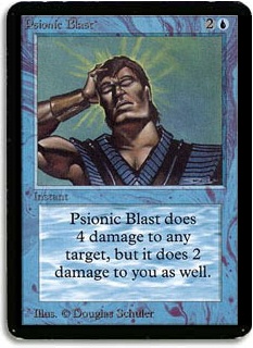
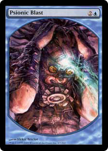
I’m sure there’s some associated loss of street cred, but I just want to not memorize the order on this card, or you know, exactly which stupidly good
things it does. Text-full!
I just can’t resist the urge to put these two next to each other. /aside
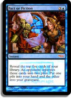
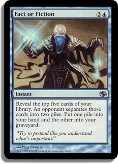
So, I tried to tell my fiancé Justin that I liked the new art better — it at least makes me think that something cool is happening, not just goblins
riffling through papers — and he went off on a long tangent about Squee being put into the graveyard through Fact or Fiction and then coming back. So I
guess I have to say that maybe the old art has some sort of reason to it, but I’m going with pretty here. I like the new one.
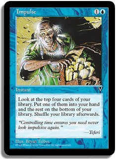
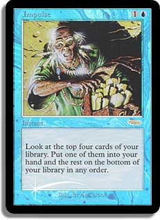
Same beautiful art but shinier. Yes, please.
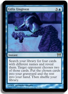
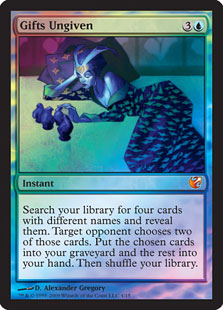
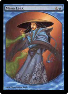
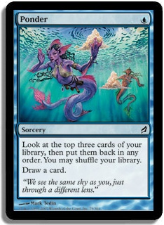
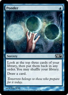
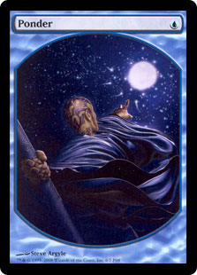
So, blue is pretty light on promo and alternate art cards in general (at least compared to white — I guess I should finish the rest before passing
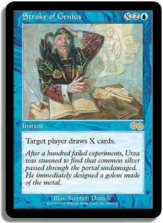
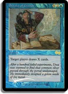
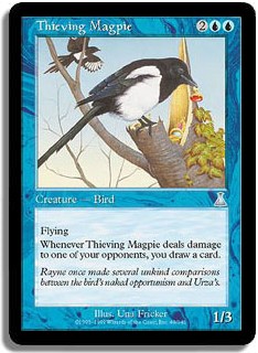
judgment), and a lot of the promos have the same art. So here we are. Does this art make you think of drawing cards? I’m not sure impulsiveness is
really the same as being a thief. Oh well, foil it is.
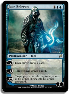
Alright, baby Jace isn’t actually in my cube anymore, but I had to mention him because this might be the most offensively bad art in this entire
section. I love Kev Walker, but what were you thinking? Is Jace a frat boy? Does he listen to Dave Matthews? Does casting blue spells just make him
feel really bro-y?
The manga version (from the Japanese release of Jace vs. Chandra) doesn’t have a card image yet, but it’s pretty silly. Maybe people will choose to run
it just based on rarity.
The book version is fine, but I don’t know why you wouldn’t just run the original.
Thanks, M11! I really like the new art here. The textless is also rad but excluded for new-player-friendliness.
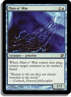
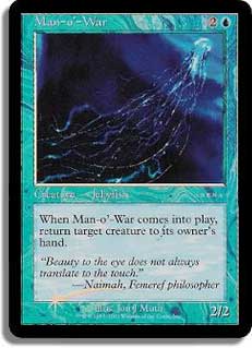
A jellyfish eating a shark is clearly cool, but the Portal wording (“from your hand”) isn’t real. I like the Jace vs. Chandra version.
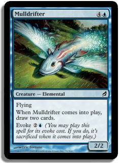
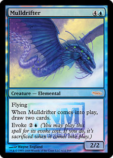
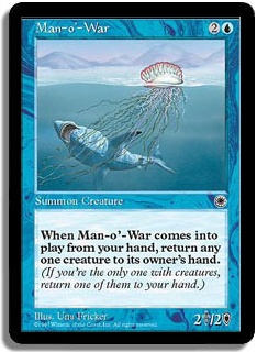
Ughh, why must they do this? Why give a promo new art (when the old art is already awesome) unless you are going to make an effort to have the new art
be good as well? The original art is awesome. You think, I like this fish. It has wings. I can see that it likes me back, hence the card draw. What is
that new thing? Is it even a fish anymore? This is just the worst.
Again with balancing broken cards by giving them bad art. I don’t find either of these particularly flavorful or evocative of what the card does, but
at least the Urza’s Destiny one is black-bordered.
I feel like this one comes down to a personal decision about Merfolk nipples. I’m going with the M10 version myself, but I could see running the
textless one if I was okay with that in the cube.
Wow, nothing better than the old wording, where they remind you that your cards might have drawbacks. Adorable.
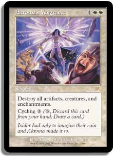
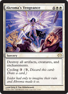
Until I started writing this article, I actually didn’t know that this guy was in Jace vs. Chandra. They did a really nice job with the art, though —
just like Akroma’s Vengeance — the newer version is really bright and crisp. I’ll be upgrading.
How could you not love the Revised version? I love the hilarious mismatch of badass, not-really-blue creature with doily-wearing man. But this card was
constantly getting sorted into green, so now I run the From the Vault: Exiled version, which lacks charm but has shininess.
Judge foils with the normal expansion symbol are a little odd, but nothing much to see here. I run the foil, 100% personal preference.
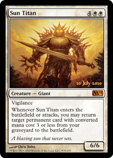
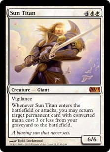
I’m honestly surprised that this card has five printings and only two distinct arts. I like the Destiny one — I think it reads well and is kind of
adorable — but both are well-done. Can we get a sweet promo?
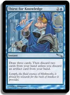
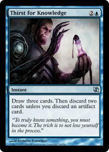
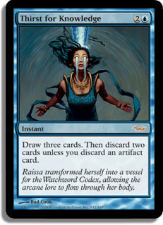
I’m kind of a sucker for ladies rather than not-ladies in my Magic art, and I think the promo is very pretty although the straightforward
interpretation of the original charms me. “Hey guys, I’m literally drinking a vial of knowledge!” I’m going with the FNM promo, but the new Tezzeret
art is well done if a little dark. I think that would be my second choice.
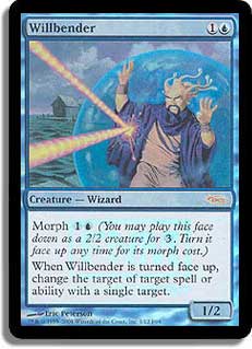
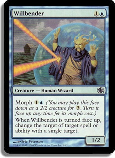
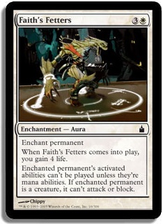
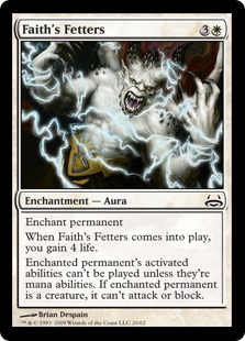
Obviously just the foil vs nonfoil, old vs new border issue here. I do wish there were a version without reminder text on Morph. For some reason that’s
just the tweaky thing I’m into now. Personally, I like the foil, and I like the new border, so I’m going with the FNM promo. But you can have basically
any permutation you want of the same art, which is kind of cool.
BLACK
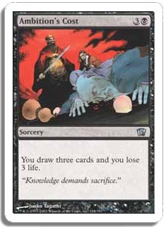
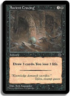
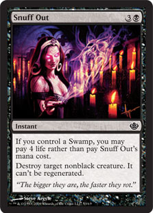
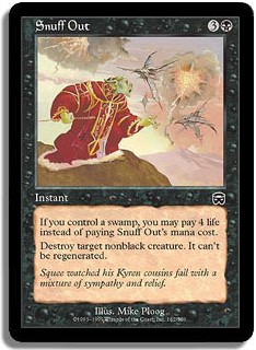
I didn’t even know that Ancient Craving existed until I started working on this. I think I’d rather have Ancient Craving here — the art is just so
ghostly.
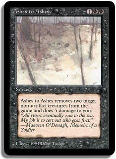
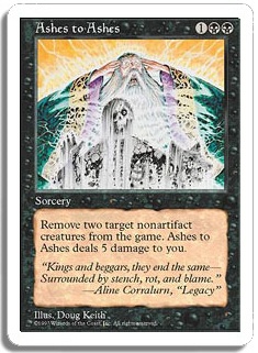
The Dark, all day! I guess the 5th Edition version conveys that there are two things, but The Dark art is just so bleak and simple. I feel like it
really fits in flavorwise with the name of the card. Also it kind of looks like a Left 4 Dead level… something I always support.
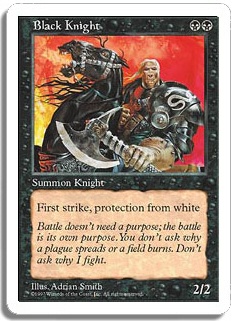
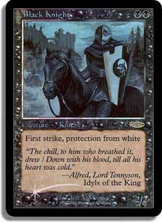
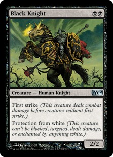
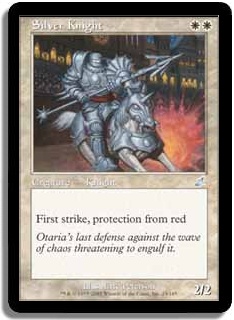
There’s definitely going to be a theme here — I really like black cards to have kind of creepy, atmospheric art. The Alpha Black Knight gets in there
right away. The 5th Edition one is pretty jarring to look at, but I wouldn’t blame you if you chose it just for the gratuitous horse teeth.
Same art, new border. The art really shines in the Phyrexia vs. the Coalition version: “Look at this delicate flower of a minion.” As is usual in these
cases, I like the new border, but I’ll run the original if it’s foil.

FNM, of course! If you’ve read my previous Art Fights, you know I like the new border. This is also a card where the colors end up really clear and
bright in the foil.
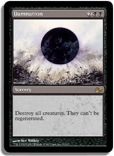
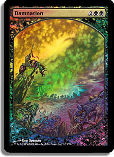
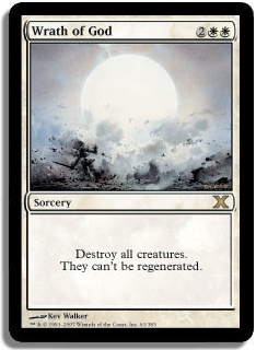
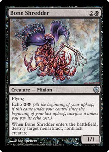
Ah, Ron Spencer. Is this some sort of elaborate joke? Like, maybe he just took a bit of goo dripping of some gross insect creature, blew it up really
big, and then sent it in. I feel like that would explain a lot. As usual, Kev Walker is a flawless man. I definitely bought a foil Damnation as a
birthday present for myself. That’s how beautiful this is in foil.
Is this the first time Art Fight has come down to flavor text? I’m going with the Arena version. It’s successfully creepy, and I have a weak spot for
the promos.
I think nostalgia wins out for me here: “Even a demon has to study!” Both of these are pretty charmingly literal, although shouldn’t the demon be the
one doing the teaching?
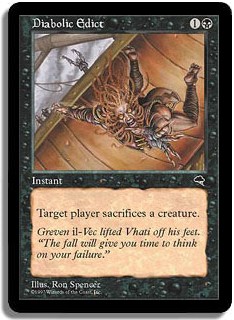
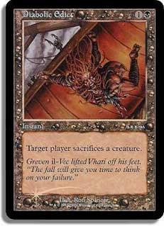
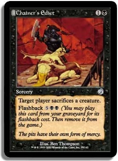
Same art, but this time the Arena version is the only way to get a foil Diabolic Edict. Maybe this will get a new printing. It’s such an iconic card,
and it’s never had alternate art. In the meantime, it’s the Arena foil for me.

The 7th Edition art is just ugly, but what’s happening in the FNM foil? I can’t quite parse it. Maybe the storyline would help there. Either
way, the Divine vs. Demonic/M10 art is just fine. That’s the one I’m using.
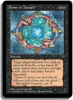
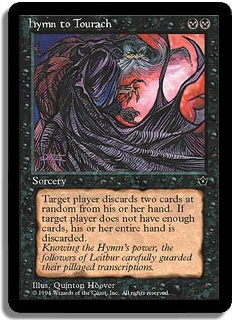
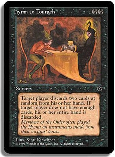
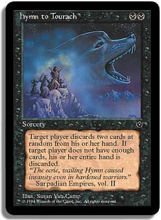
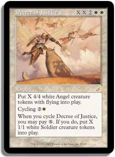
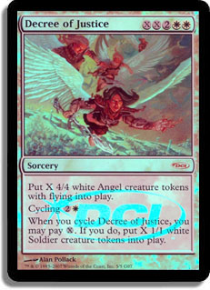
So many choices! I run the Kirscher one — it wins on hilarity, hands down. I’d love to see the art direction for that card. The Van Camp art looks like
the sort of T-shirt designs they love to print in my home state of Oregon. I think my second choice would be Danforth. It’s pretty literal, but the
perspective is unusual.
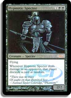
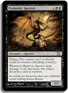
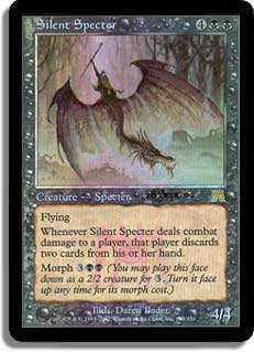
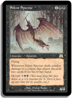
This one pains me a bit, because the Alpha art for Hypnotic Specter isn’t what a Specter has come to mean in Magic. Nostalgia wins out for me, though
the 10th Edition art is really beautiful. I think Greg Staples did a great job on what I imagine was “baby Specter, learning to perch.”
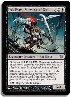
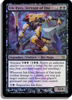
The prerelease foil isn’t bad, but I really love the normal art here. The composition is so much more interesting, and the background just seems more
fitting for a Ninja.
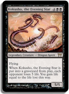
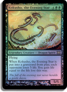
I know some people don’t like the From the Vault foiling process, but I really like the ultra-shiny, lacquered look. For that reason I’m pretty
covetous of a From the Vault Kokusho, though the art would look great in any version.
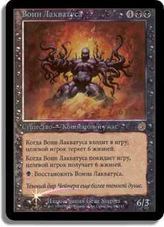
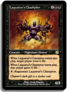
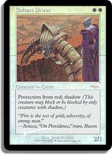
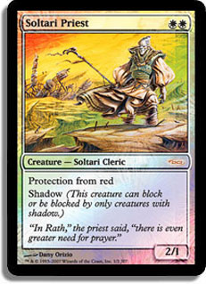
Laquatus’s Champion was printed as a prerelease card but only in Russian. This bums me out because I love fancy things in the cube, but I don’t like
non-English or textless cards because I want to keep my cube accessible. My loss, I guess. That means my vote is with the Torment version, but I’m a
little sad about it.
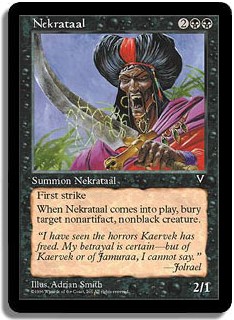
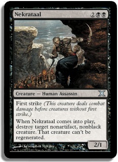
I like the Visions Nekrataal. It breaks the mold of full-body art for creatures, and it’s distinctive. Also with Visions, you avoid the first strike
reminder text. It’s the little things!
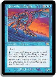
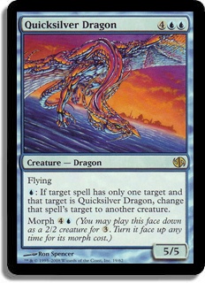
Here the choice is just old border vs. foil. It’s interesting that that choice appears since it’s more often the other way around (like Akroma’s
Vengeance and Quicksilver Dragon). Paradoxes! Anyway, I like the foil version here, no surprise.
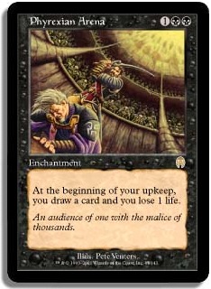
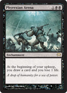
The flavor of Phyrexian Arena is pretty baffling. I get the losing life part, but what exactly does drawing cards have to do with a brutal battle to
the death for the purpose of entertainment? That said, the art on both of these clearly expresses the name of the card, but I like the mistiness of the
8th Edition art. (I choose Planechase for the image, since it’s black bordered.)
Ugh, that foiling process! Also, isn’t it weird that there’s no date on it? I like the regular foil here.
Wow, there’s a bunch of cards this time where the original art was used for a promo. In this case, the prerelease promo gets you the set symbol
watermark—good enough for me.
New art, all the way! I’m not necessarily a fan of putting planeswalkers on every single card, but Liliana fits here, and the old art is pretty bad.
Unless you’re some kind of Squee apologist, I’d go with the Garruk vs. Liliana version.

I think Ron Spencer actually nailed it here. What’s more scary than waking up to realize that your skin is gone? Gross. Luckily it’s been handily
fancified into both an FNM foil and a textless Player Rewards card.
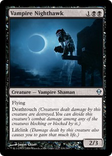
Pro tip: If someone asks you to do alternate art for a Jason Chan card, it’s a trap. The original art is incredibly beautiful and unique and set the
scene for the whole tribe. The new art is uninspired and lacks the calm, Shaman-y mood of the original.
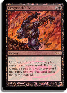
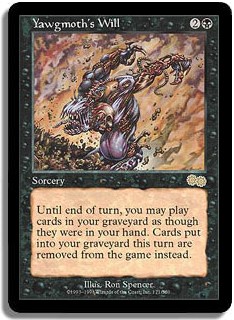
I’m bummed that this won’t ever see another printing. I like the new border, so at some point I’ll try to get my hands on a Judge Promo. The art is
nothing spectacular, though I find it disappointing when the art doesn’t make any attempt to represent what the card does. I think Wizards has moved
away from “generic scary looking thing” for black cards, and that’s a good thing, but writing this section made me realize that black is really lacking
in cool promos. Man up, Wizards! Or just hire Jason Chan more often.